Wednesday, July 26, 2017

Goldilocks and the Three Bears

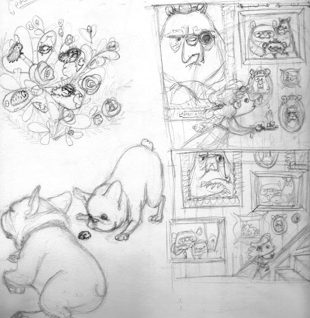
Sometimes I get an idea for a piece (and possibly for a book dummy) by just taking some time to draw in my sketchbook to see what falls out of my head. Initially, this was the sketch (top right corner):

I was playing with framing in the sketch directly below it. I was also drawing my tenacious (and sleepy) Frenchie, Baxter, but that's another blog post (I will also revisit the caterpillar-infested bush in the upper left corner).

I decided from my second sketch that 1) I wanted to change up the pictures on the wall, 2) I liked the idea of decorative woodwork, though I also preferred the tighter crop of the original sketch, 3) Goldilocks needs to be more of a contrast to the Three Bears & 4) I needed to abandon the idea of the larger bear painting--it was too distracting.

I came up with this:

Much more fun! I made some minor sizing adjustments, and here is the finish...


Tuesday, April 18, 2017

Another Month, Another Entry!

Something about the SCBWI Draw This prompt word really inspired me this month, and this idea just popped into my head. It was really fun to do, and I have been craving cheese puffs EVER SINCE.


Thursday, February 9, 2017

Finished! Winter Postcard/ SCBWI "Draw This!" Entry

The finish is finally here, and I can't wait for the postcards to come in. Below is the finished postcard. My submission for Draw This! omits the bottom half.


Monday, February 6, 2017

More Color Studies

Even though I do my first color studies in Photoshop, I also do traditional color studies. I have also been experimenting more and more with limited palettes, and a traditional color study helps me reevaluate my color choices. For this piece, I chose to use Payne's Gray, Pthalo Blue (Red Shade), Cadmium Red, Burnt Sienna, Naples Yellow, and Titanium White.


I also had been toying with the idea of making a pronounced heart shape with the bird nest, somehow, but I was on the fence about it. However, once the SCBWI February Insight came out and announced that the Illustration Prompt word was "love," I had my answer.

Thursday, January 19, 2017

Postcards: Making Changes

In my last post, I mentioned that it was time to send out promotional postcards. However, the more I thought about it, the more I realized that the illustration I planned on using was just not going to be readable. Don't get me wrong, I'll still be doing that piece (possibly even expand it into a story/book dummy?), but I need to simplify for the postcard. I was doodling in my sketchbook, trying out some different ideas, when I came up with my [new] current postcard plan.

It began as a simple idea--a bird nest with a winter scarf wrapped around it to keep the birds warm. But then I thought I could expand a little. How did the scarf get there? I thought I'd do a little sequence to work it out, and this was the result:


I still needed Photoshop to play with the size of my characters (again, I wanted them to be more readable). This is the final sketch:

I haven't yet decided if the bottom image will be on the back of the postcard as a little surprise, or if it will look better as it is here.

I also did a rough color study in Photoshop just to get an idea of where this will be going. These colors aren't set in stone, they're just a guide.

And now, on to the final!

Saturday, January 14, 2017

An Ode to Photoshop

Admittedly, I need to be more diligent with sending out promotional postcards. That should probably be my belated New Year's Resolution. So I am starting by sending out a winter-themed illustration. I was doodling in my sketchbook when I had a fun idea that had a lot of moving parts.
There was one problem: in my excitement I left no room for text, and text is kind of important for a postcard. I also wanted to fiddle around a bit with the scale of the animals so they not only read better, but so they remained the focus of the illustration (not the snowman) and kept the eye moving.

Enter Photoshop. I love Photoshop. It's a little early to declare a Valentine, but I. LOVE. PHOTOSHOP. It's really the perfect tool for when your composition is already established, but you need to tweak EVERYTHING. It's also just great for cleaning up scanned sketches.
It doesn't look too drastic, but TRUST. So much is different. Everything just works better. I debated removing the owl from the upper left corner, but I kept it because I think once my name gets put at the top, it will work.

Here's a side by side comparison:


Monday, December 5, 2016

Tomie dePaola Award Contest 2017 Entry

As I've done for the past few years now, I submitted my entry for the Tomie dePaola Award Contest. The prompt was a little different this year:

This year’s assignment is to cast yourself, as a child, in a picture book. Show your autobiographical character in a scene and make sure to convey the emotion of your character. The viewer should be able to read the emotion of the character immediately and clearly.

I was very intimidated at first, but once I got into it, I had so much fun. Here is the final image.